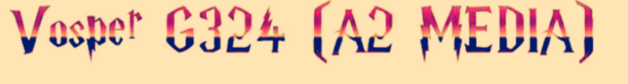
Wednesday 17 April 2013
Sunday 7 April 2013
Friday 5 April 2013
Tuesday 2 April 2013
Evaluation Part I: In what ways does your media product use, develop or challenge forms and conventions of real media products?
I decided to tackle this by doing a radio-style interview with my dad, in which he interviews me pretending that I am a successful short film director.
Thursday 28 February 2013
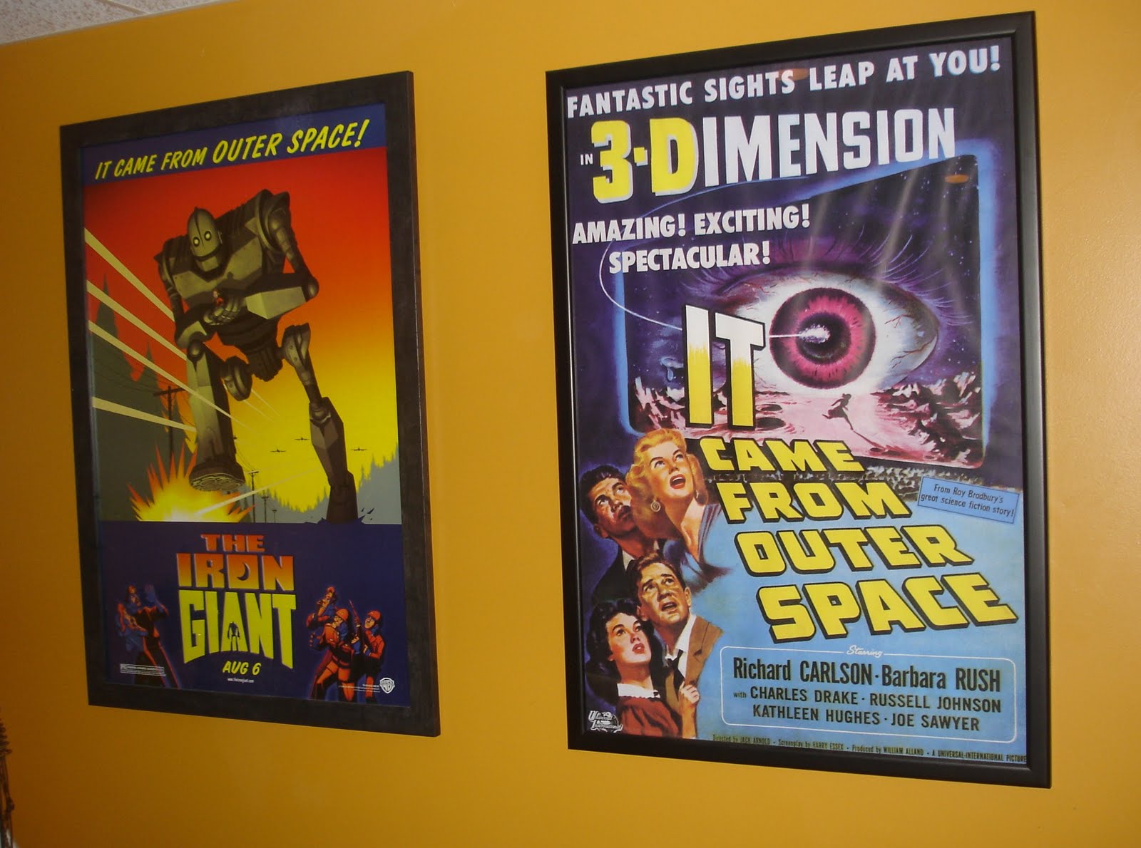
Teaser Poster Analysis...
Examples of Teaser Posters

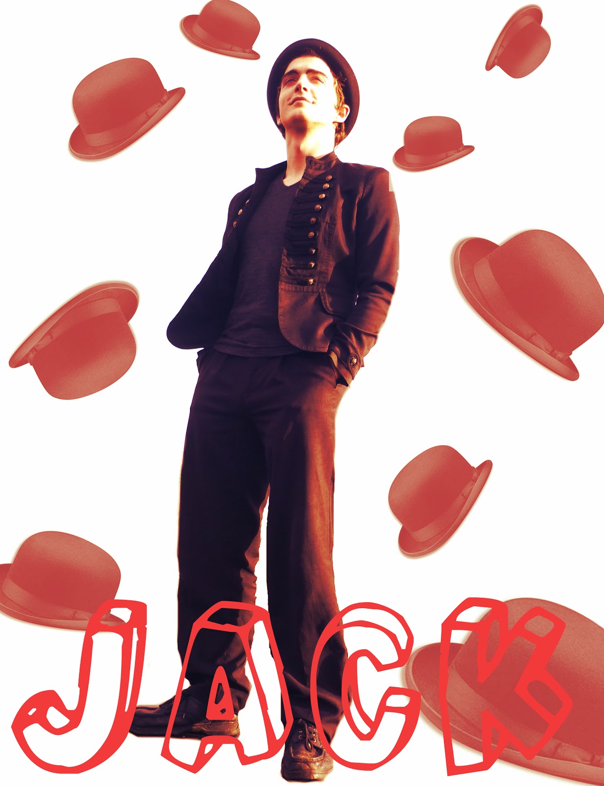
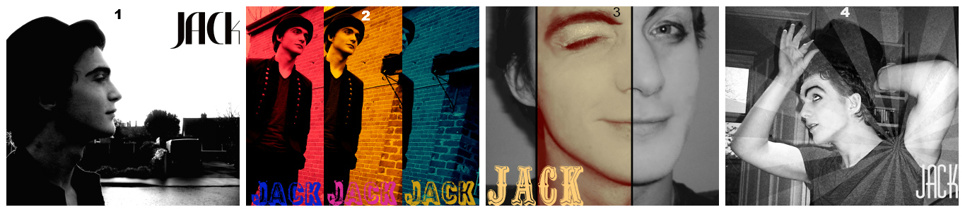
My Teaser Posters


Wednesday 27 February 2013
Poster Re-Design After Audiencve Feedback
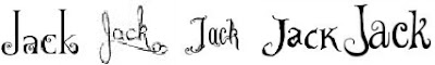
I was given some constructive criticism regarding my poster from a few of my peers. One said ...
" I would change 'Jack.' from red to black." &
"Be careful though, as you've contrasted Jack's legs and they've come out very black, as intended I assume, when you re-colour the red to black you might want to consider making the sections on black, white, or go with a completely different font."
"Be careful though, as you've contrasted Jack's legs and they've come out very black, as intended I assume, when you re-colour the red to black you might want to consider making the sections on black, white, or go with a completely different font."

As can be seen I overlayed the font in black to create a 3D look, making it easier to read.
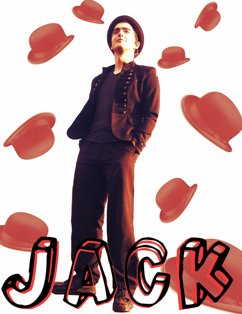
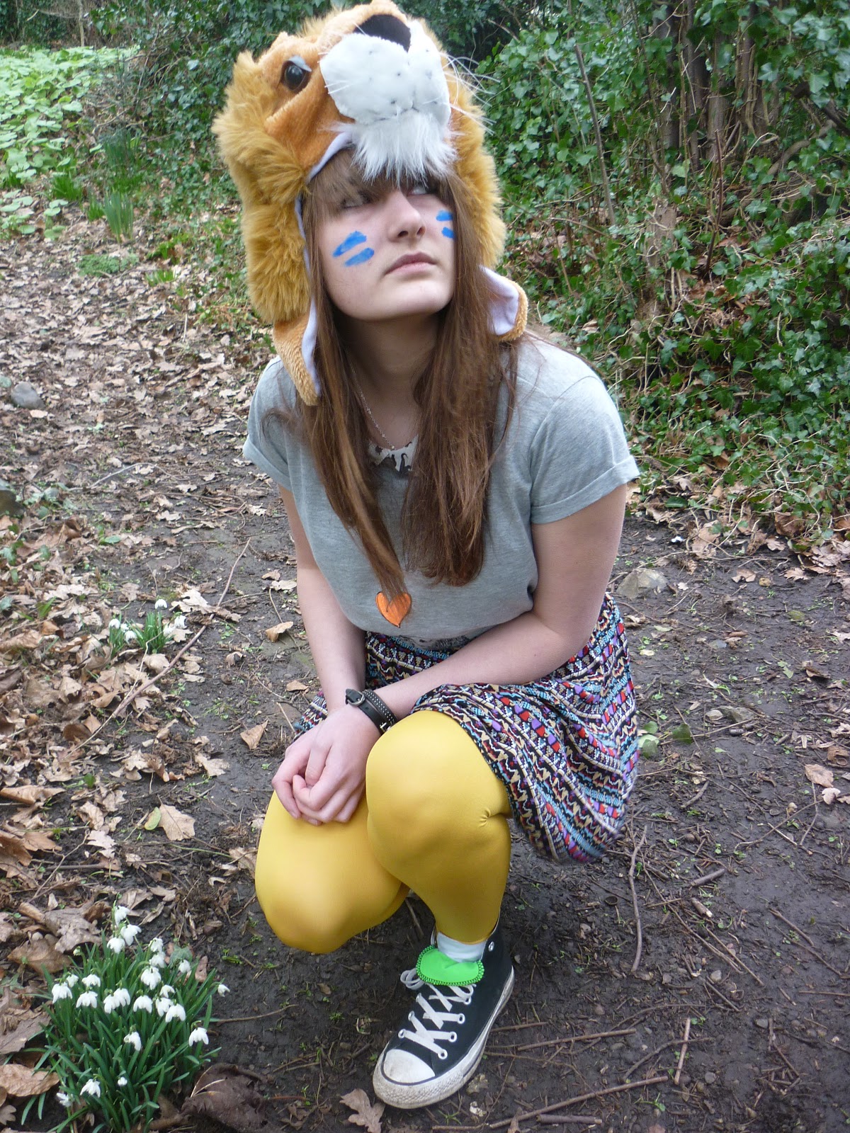
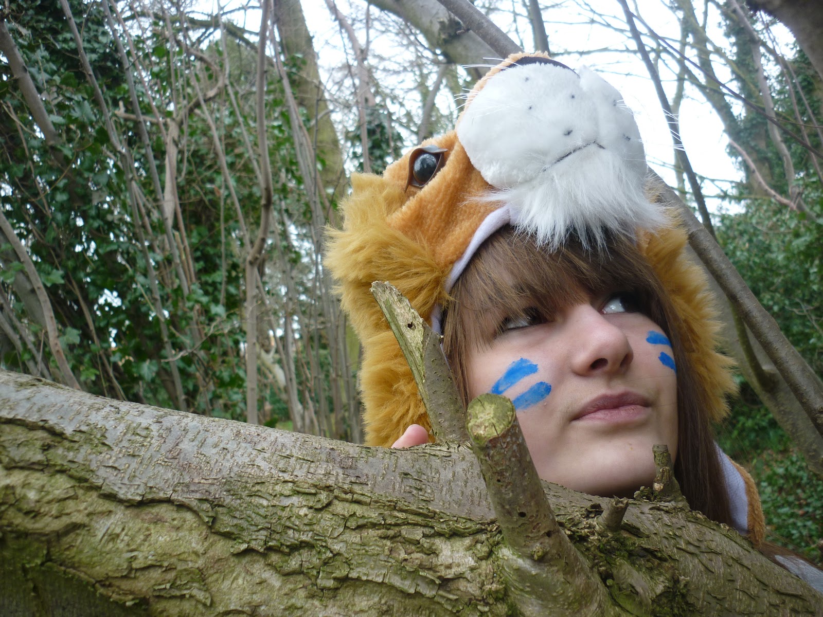
Final Filming Day: Photo Shoot
I decided to do a photo shoot of Evie in order to create a teaser poster. Here are some of my favourite photos from the shoot.

Monday 25 February 2013
Final Day of Filming
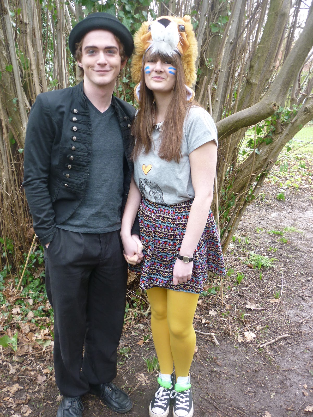
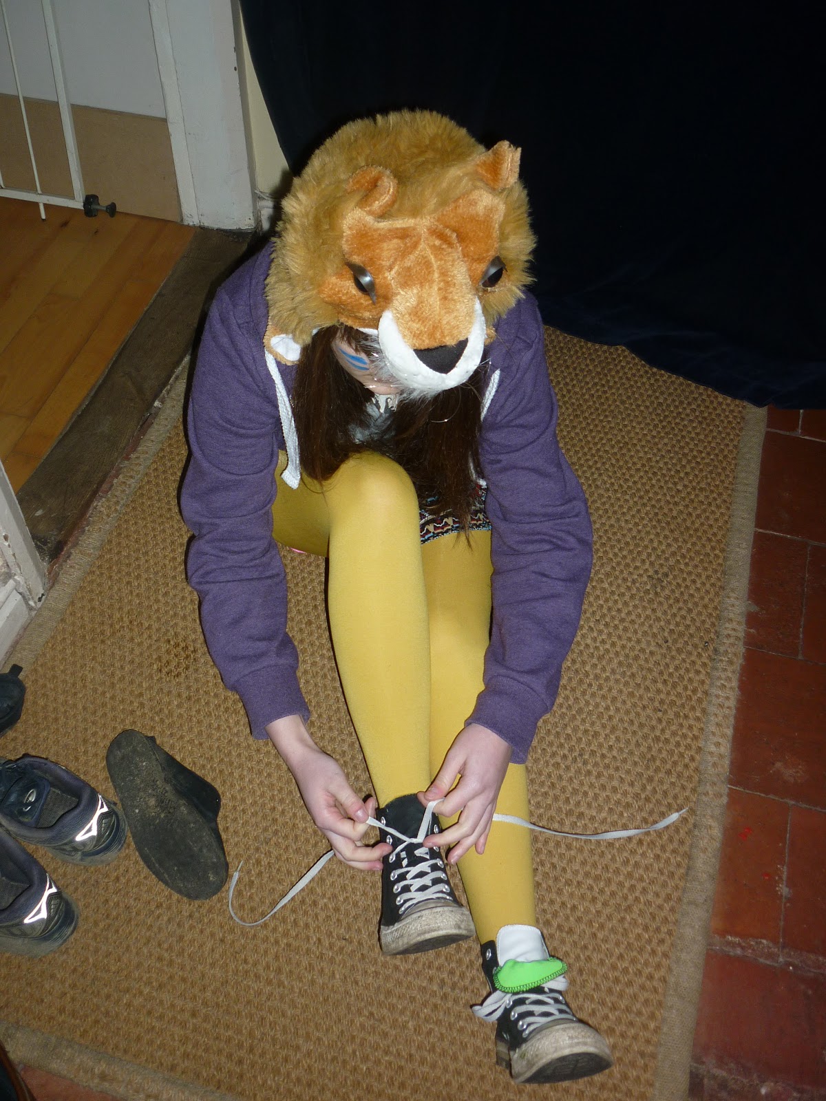
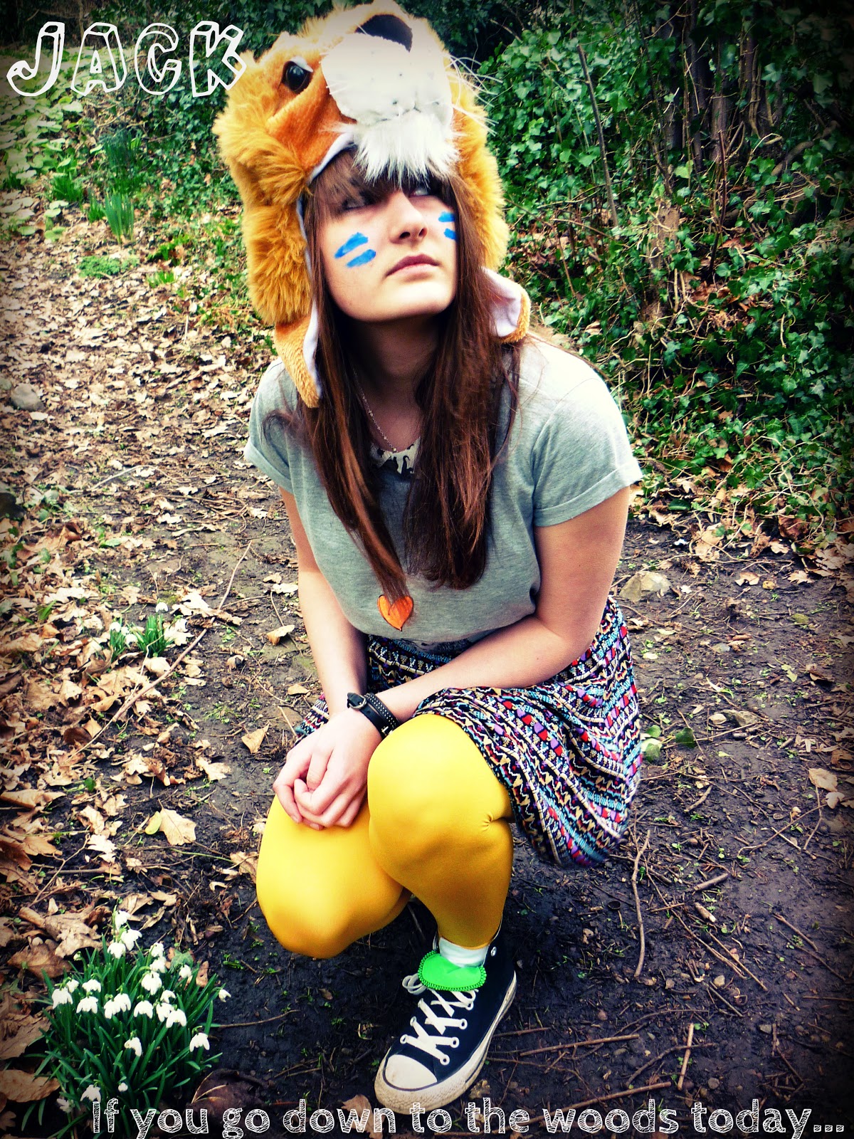
Finally finished filming! And I am very happy with all my footage. The finished film is due to be completed and uploaded for Thursday, 28th February. I made a few last minute changes to my film, but in general all went to plan in that the actors were able to make it through illness and one returning from Russia! I recreated make-up for jack as similar to the original as I could. And Evie's make up was done exactly as I had originally shown in my make-up video. All in all a very successful shoot despite the cold. In terms of last-minute changes I used the small woods at the bottom of my garden as the setting for them to meet and the end showed them walking away wearing each other's hats.
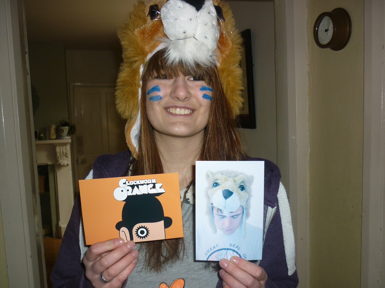
Evie with the final photographs
Saturday 23 February 2013


Film Reviews: Part IIII
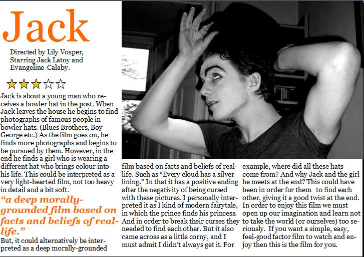
My Film Review...
What Image will you use? Why Is It Important To Get This Right?
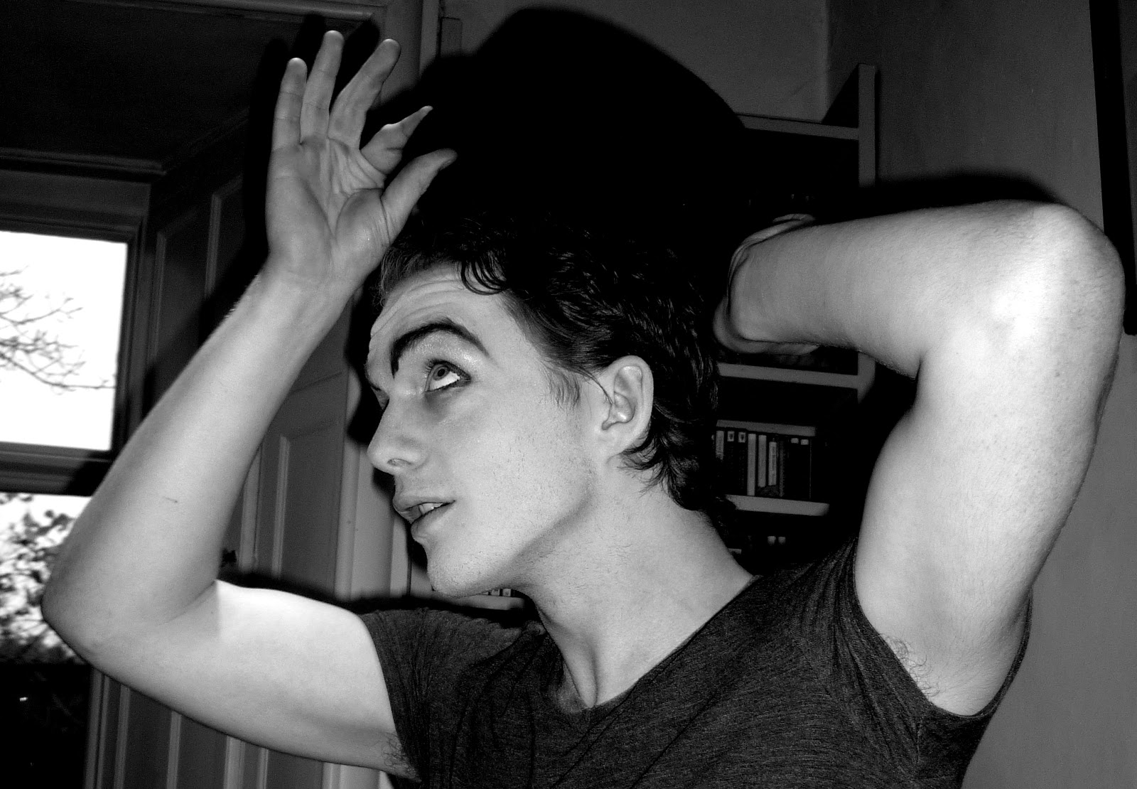
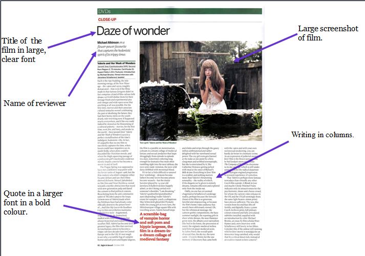
I am going to use a similar style to that of Sight&Sound Magazine, as they specialise more in Independent Films- which is where I see my film as fitting best. It is important to use a good screen-shot from my film as it will be a big image, taking up a large proportion of my page. The image I was thinking of using is when Jack is putting on his hat.
Film Reviews: Part III
Does A Bad Review Ruin A Film's Chances? & Do Audience's Take Notice of Them?
Monday 18 February 2013
Film Reviews: Part II
Who writes reviews?
There are many different reviewers, for example Mark Kermode. Kermode does reviews on BBC Radio 5 Live, often with Simon Mayo. I found footage of him reviewing The Angel's Share by Ken Loach. I chose a review of this film because it is of a similar genre to mine (Independent Comedy.) http://www.bbc.co.uk/programmes/p00td0nn. Also, because I have decided to use silent film as my main style, I found his review for The Artist, in the style of a silent film. http://www.youtube.com/watch?v=vP2kdKjGVSk.
Who reads reviews?

Many people believe that just the film "Buffs" read reviews. A buff is "One who is enthusiastic and knowledgeable about a subject." In this case, film buffs are extremely enthusiastic about films and will generally be drawn to more independent, art house films.
However, as they are now on the radio and in magazines and newspapers, such as The Guardian, reading reviews is far more common. People read reviews in order to understand the quality of the film or whether they feel they would enjoy it.
Film reviews even stretch to magazines such as ZOO, Heat and Nuts. This shows that there is a wide range of different people who read reviews.
Film Reviews: Part I
Written reviews in magazines and newspapers...
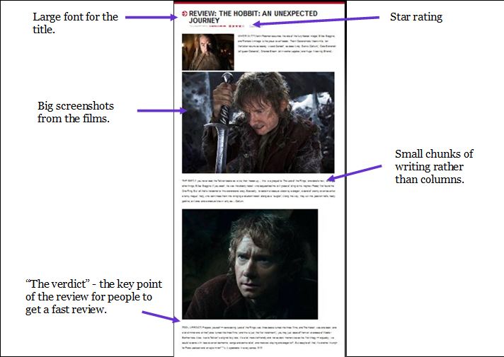
Here are a few reviews I analysed in terms of layout:This first example, from The Sun. As can be seen this is two reviews on one page rather than a page spread devoted to one singular film, which is more often for large "Hollywood Blockbusters."
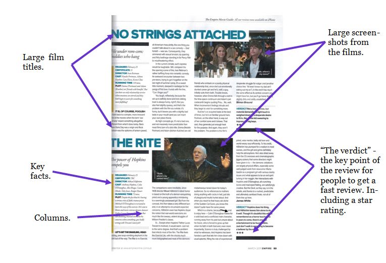
My second example is from Sight&Sound magazine, created by the British film institute, reviews far more independent films.
"The BFI was founded in 1933. We are a charity governed by a Royal Charter. We combine cultural, creative and industrial roles, bringing together the BFI National Archive and BFI Reuben Library, film distribution, exhibition at BFI Southbank and BFI IMAX, publishing and festivals. We award Lottery funding to film production, distribution, education, audience development and market intelligence and research."-BFI
As you can see there are many similarities between the two reviews, for example they both feature large screenshots from the films and are written in columns.
Sunday 10 February 2013
Alternate Ending... The Girl (COSTUME)
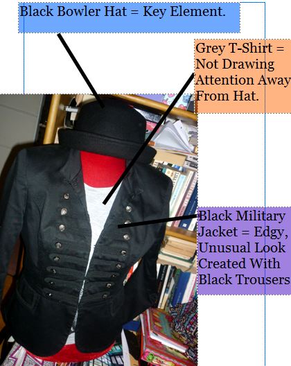
I have had several ideas for the girl's costume (Other than obviously, the lion hat). I chose the theme of bright colours and bold prints to clash each other. This outfit will appear more as a costume than an actual outfit... showing she too is a very unusual character, much like Jack. Also, her bright colours will be very different to Jacks grey and black costume making them seem both unusual in their own ways.

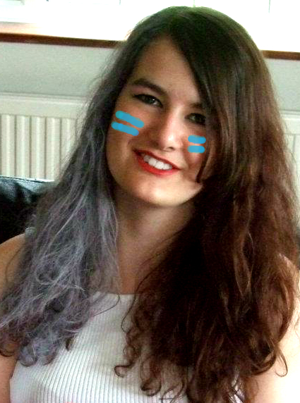
Alternate Ending... The Girl (MAKE-UP)
I am (Hopefully) going to use Evangeline Calaby as my Actress for the "Girl" at the end of the film. Here is an idea of what she may look like in my film in terms of make-up...
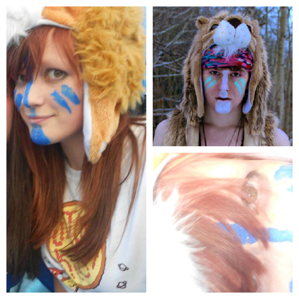
I created a small mood board of pictures of me as UK and of UK himself to give a feel for the character
Research Into The Genre Of Silent Films
I am experimenting with the idea of silent film in Jack. So I decided to do some brief research on short silent films.
These are two Charlie Chaplin films I found...
Charlie Chaplin in "The Immigrant" (1917)
Smile, Charlie Chaplin , 1936
I found that there is a lot of focus on facial expressions, and actors almost mime their feelings through body language, much like Jack when he finds the photos of people wearing bowler hats.
Initial Ideas for my poster... Ideas 1 & 2
I tried out a range of different styles to see what I thought would work for my film. These are only IDEAS, and I created them very quickly.. but here are the results so far:
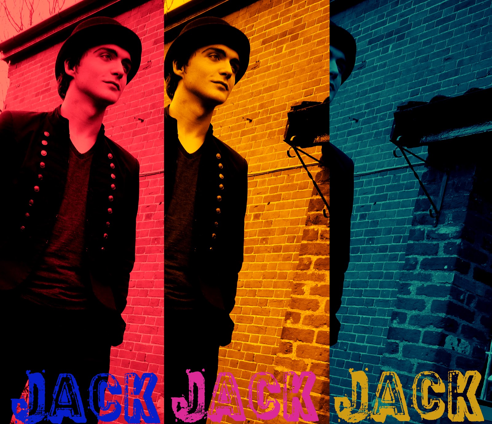
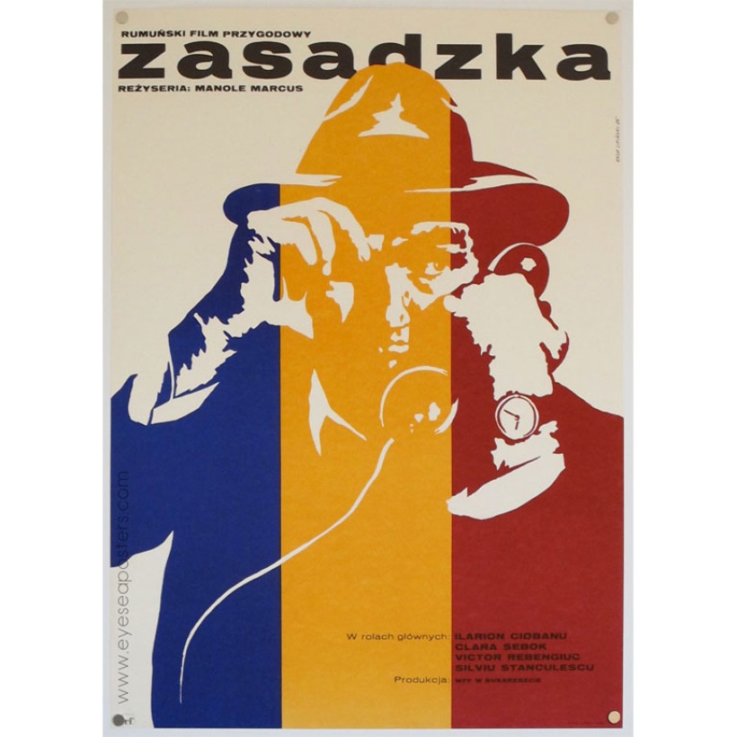
In this example, I experimented with colour, making the poster look quirky. I was very much inspired by the film poster artist Eryk Lipinski. Who designed ther for a Polish film called Zasadzka. Lipinski's use of block colour is very similar to that which I used for my poster.


Here, I experimented with black and white for my poster, as I might put my film in black and white. This poster appears to be very old-fashioned, and I explored the vintage look for posters in order for inspiration to create it...
 Firstly, I found this poster for Pulp Fiction, in black and white. Unusually, this poster is a screenshot from the film. My poster was a photograph taken after the film, but is very similar to one of the shots in my film.
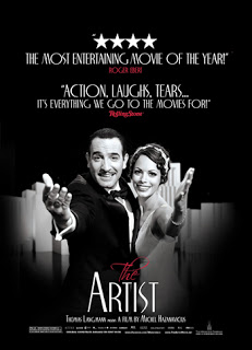
Saturday 9 February 2013
The Popular Culture Of Film Posters
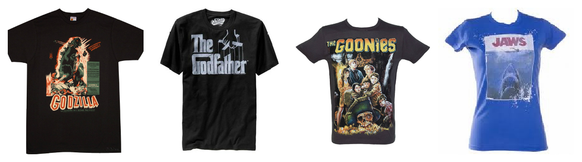
Movie posters (Key Art) are extremely influential in our popular culture. I am going to explore several areas of the popular culture of the film poster, beginning with t-shirts....
Many of film "Classics" such as Jaws and Star Wars have their posters made into t-shirts and other products. In fact, Star Wars' merchandise franchise was worth $30.57 billion in 2012. Many websites specialise in film t-shirts such as TruffleShuffle.com. By buying 'classic' poster t-shirts raises our own social desirability like wearing a Beatles t-shirt or a Nirvana hoodie, it's not neccisarily because we love the band (Or, in this case the film) but because we know OTHERS will like the film, giving us respect for it. Here are some examples of "classic" moie poster tees...
Moving on to posters on the wall...
Many of us have posters of our favourite movies on our bedroom walls, and we often see movie posters outside cinemas advertising their films. Sometimes, on the ways of our cities, so much so that there has been an uproar against it, officials said...
"Film posters are pasted on every wall, flyovers and underpass, thus defacing the city. The film industry never sought permission for such acts. Now that sticking posters have been banned, this is a crime. We will crack down on everyone who dirties city walls,''
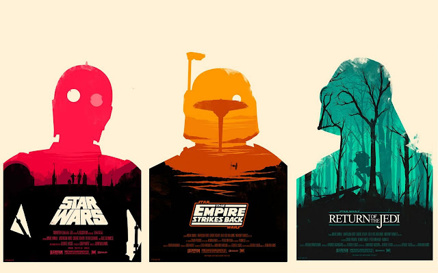
There are many Movie Poster Artists such as Olly Moss who designs very simplistic film posters, making them into an art rather than a simple form of advertisment. Here are his designs for three of the Star Wars films.
Monday 14 January 2013
The VERY Rough Cut
A bit choppy, but an idea of what my film will look like. Missing ending, tint, opening title and a couple of sound effects. Here is the music I used...
And this is my rough cut...
Sunday 13 January 2013
Ancillary Task: Research and Planning: Part Two
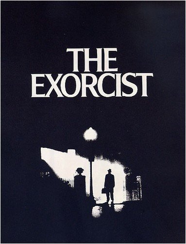
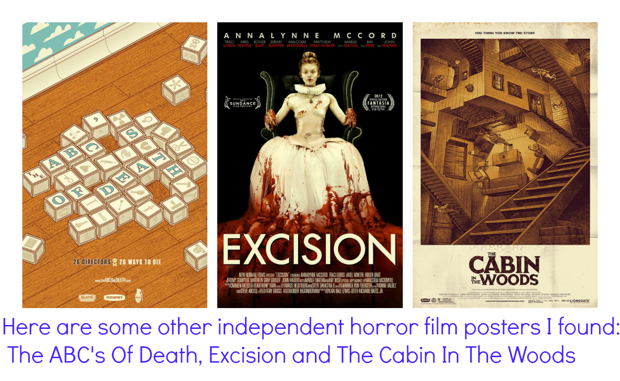
Independent Hollywood is a colossal chunk of films. We decided to narrow the spectrum to Independent Horror Films.
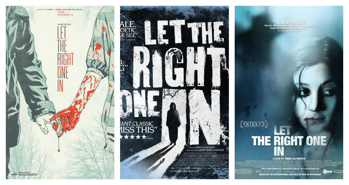
One of the key films I researched was a Swedish Vampire film "Let The Right One In." directed by Tomas Alfredson.
"Oskar, a bullied 12-year old, dreams of revenge. He falls in love with Eli, a peculiar girl. She can't stand the sun or food and to come into a room she needs to be invited. Eli gives Oskar the strength to hit back but when he realizes that Eli needs to drink other people's blood to live he's faced with a choice. How much can love forgive? Set in the Stockholm suburb of Blackeberg in 1982." Written by John Nordling, Producer.
Another example of an independent horror film is BITTER FEAST (2010) Written and Directed by Joe Maggio. "A celebrity chef exacts revenge on a food blogger who torpedoes his career."-IMDb

As can be seen, the poster is extremely compelling, giving very little away about the story, other than the fork and spoon, along with the plate of food, which suggests his status as a chef.
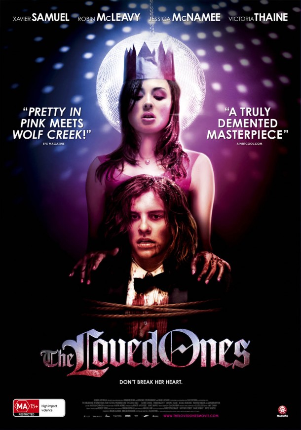
The Loved Ones

"Okay, this is a bit of a cheat. I did not see this for the first time this year, rather my very first viewing was 2 years ago, but due to the fact that it had a US release in 2012 I had to include it. Not only is this my joint pick of the year, it is one of my favourite films of the last 10 years.We follow Lola, a gloriously creepy Australian teenager, as she sets about trying to win the heart of a classmate, with a rather unusual flattery technique, including nails, syringes, drills, one particularly devoted father and a song you won’t be able to hear ever again without shuddering. Brutally fantastic, Lola Stone is one of the most original psychopaths we’ve seen for years, making this film without doubt a must-see."- HorrorQueen
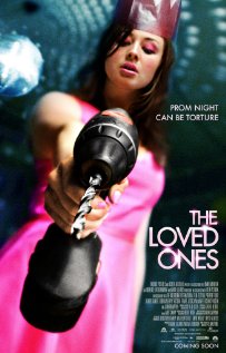
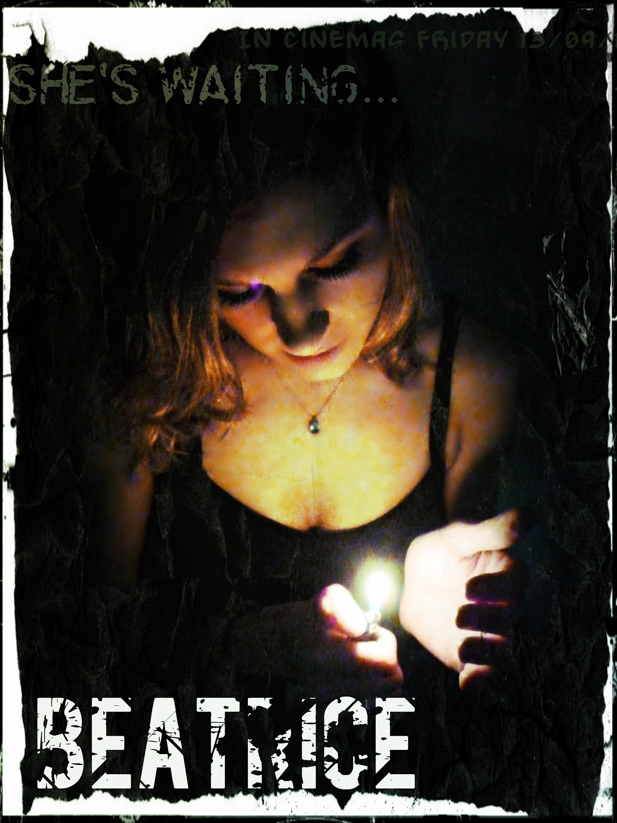
Here is the poster for The Loved Ones, it is a classic case of "The more you look, the more horrific it gets." there is also, much like Let The Right One In, another poster. This one features the phrase "Prom night can be torture." Which is a case of dramatic irony, as it is usually associated with girls not knowing what to wear to prom, or getting stressed about it. However, the meaning in this film is literally that she tortures her "Prom Date." I picked up on this use of a catchphrase on horror film Posters. For my film poster I used "She's waiting." Similarly having a double meaning.
Bibliography:
Friday 11 January 2013
Music Ideas #1
I have been considering music for my short film, what tone? What genre? Will there be any lyircs.
I have loved this band called The Cure for years, and their song "A Forest." Is perfect for my short film, this is because it has a certain tone of mystery, also I wanted to use a song which meant something to me. However, due to copywright issues I cannot use this exact song. HOWEVER, I can use a cover by a far more unknown artist. So far I have found two covers which I really like.
Here is the original
And here are the two covers...
I LOVE this cover so much as it so tech-y and it doesn't have lyrics which I like, as the viewer is less likely to get distracted from the film by the music.
Here is a version by a female singer. I really like her voice but I felt that in the original, because it was a male, it fit better with Jack almost like a narrator.
Day 1 of Filming
This is one of the two shoots I will be doing for my short film. However, it is now safe to say I have 80% of my film done. The shoot began at 10:30 this morning and ended at 3:30 this afternoon. So was a fairly long, however successful shoot. The second part will be about half the time, perhaps even less as there is far less to film.
I started off doing Jack's make-up which took a fair amount of time to capture the dark and Gothic look. Here is the video of me creating Jack's look...
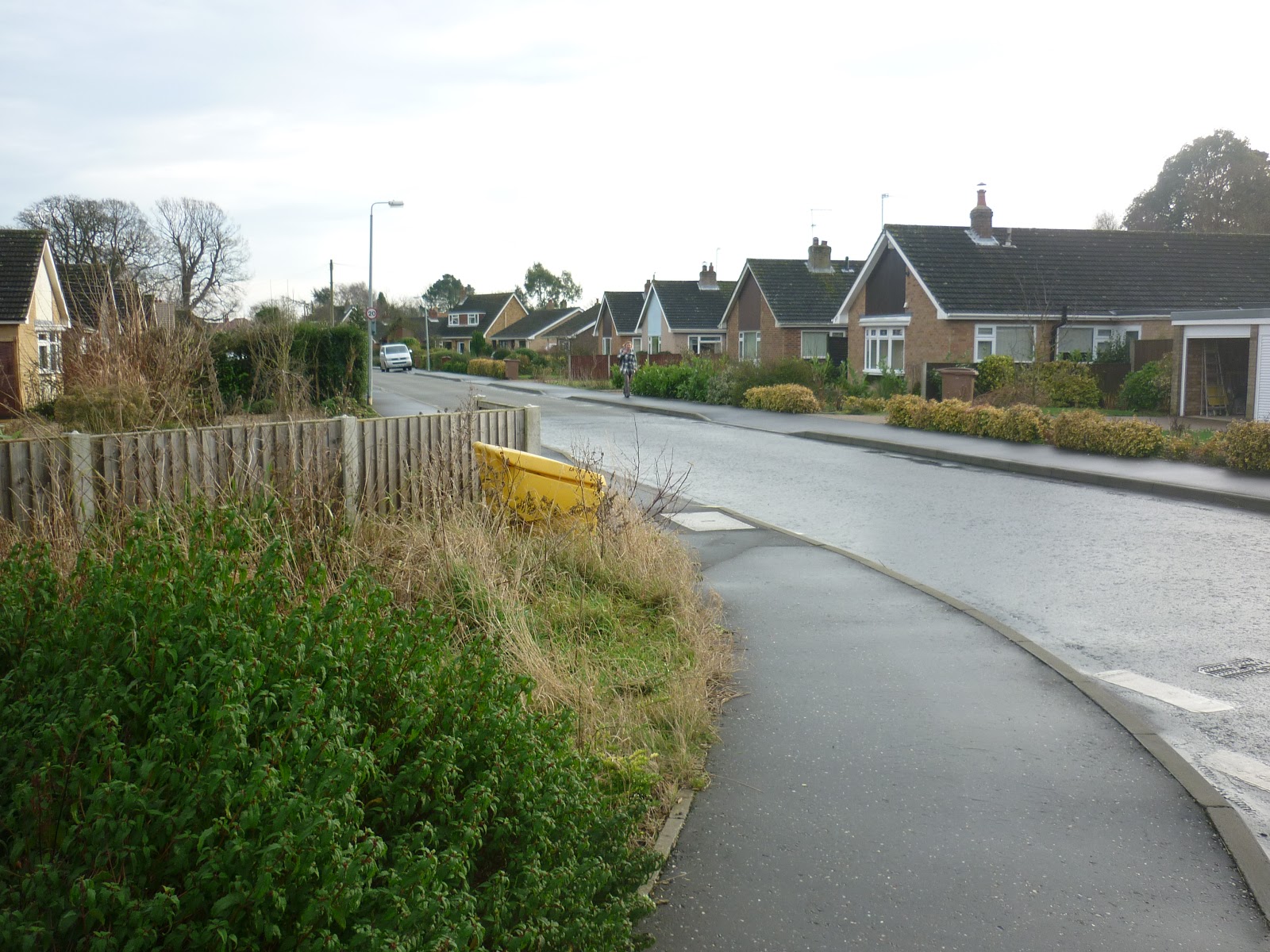
I took photographs of the sets I created for the film...
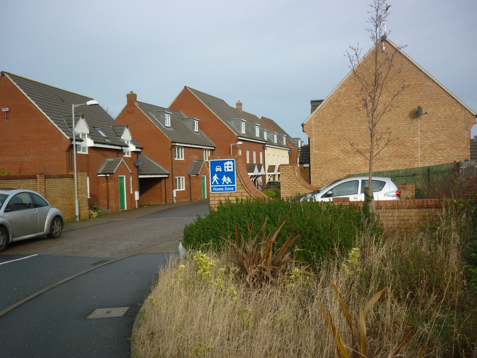
 Here are a couple of the roads I used. For example, this picture is of a housing estate called Poppy Fields. I used this as it is always very quiet, making it easier to film in. It also gave the film a far more urban feel. I also chose areas which led on to countryside tracks to vary the setting.
I changed a few aspects of the original shot list such as the opening of the parcel was not stop-motion as I felt it was more naturalistic to the film. But in general the shots were pretty much the same.
I started off doing Jack's make-up which took a fair amount of time to capture the dark and Gothic look. Here is the video of me creating Jack's look...
I took photographs of the sets I created for the film...
I changed a few aspects of the original shot list such as the opening of the parcel was not stop-motion as I felt it was more naturalistic to the film. But in general the shots were pretty much the same.
Shot List
(Alongside the title will be the sound of an alarm clock...http://www.youtube.com/watch?v=ytKfoo1Yqsw http://www.youtube.com/watch?v=ZZvRjF-X-C0)
2. Shot of eyes opening, suddenly.
3. Bird's eye view shot of man lying in bed. In the frame only the top of his chest upwards will be visible. He will be wearing a grey t-shirt.
4. Shot of alarm clock being turned off (Cut-in shot.)
5. Shot of stairs and his feet coming down them as he comes into view.
(Sound of doorbell ringing as he reaches the bottom of the stairs.... http://www.youtube.com/watch?v=y4E6tNhxeFo)
6. Shot from behind as he looks to the left in response to doorbell.
7. Shot of door from outside, Jack open door.
8. Close up of his confused face. (Reaction shot.)
9. Shot of parcel on door mat. (Point of View.)
10. Side shot of box as it is picked up.
11. Shot of box on the table. (Point Of View)
12. STOP-MOTION OF BOX OPENING REVEALING THE HAT.
13. Hands reach down and grab hat (Point of view.)
14. Over the shoulder shot looking into the mirror as Jack puts on the hat.
15. Same door shot as Jack leaves the house wearing black trousers, black shirt and hat.
16. Following Jack from behind shot as he walks down the street.
paper crumpling sound (http://www.youtube.com/watch?v=i867Jl7duPc)
17. Jack stops walking.
18. Cut-in shot of paper below his foot and his hand as he picks it up.
19. View of paper in his hand, revealing it to be a photo of Boy George.
20. Reaction close up of his confused face.
21. Cut in of Jack's hands putting photo in his hat
22. Wide shot of Jack walking down the street
23. Shot of photo in a hedge as Jack walks towards the camera and takes the photo.
24. Jack puts photo in his hat.
25. Shot of photo stuck to a sign.
26. Wide shot as Jack walks into shot, and takes the photo. He puts it in his hat.
27. Shot from behind as jack walks down the street.
28. Jack finds photo pinned to a church sign.
29. He takes the photo looking a little frightened.
30. Shot from behind as Jack throws the hat on the ground, scattering photographs over the pavement and road.
31. Jack walks towards the camera, stops, sighs, turns around, runs back, gathers photos and hat and continues on his journey.
32. He walks up his friends drive and knocks on the door.
33. They all open the door and are all wearing different hats.
Thursday 10 January 2013
Planning: Prop List

2. Photos
3. Cardboard box
4. Jack's outfit. [See blog post]
5. The girl's outfit [See blog future post]
Wednesday 9 January 2013
Subscribe to:
Posts (Atom)